

…and a Notes field right in the Info tab. That’s the detail in Typeface 4.5 that tips it from a font browser into something closer to a working journal. If you’ve ever looked at a font six months later and forgotten why you picked it, that little text box solves the problem.
Good for
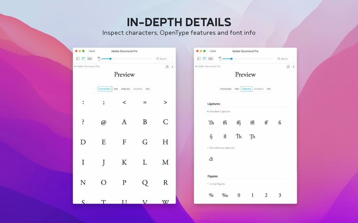
- Previewing full glyph sets — uppercase, lowercase, numbers, and special characters — before committing a font to a project.
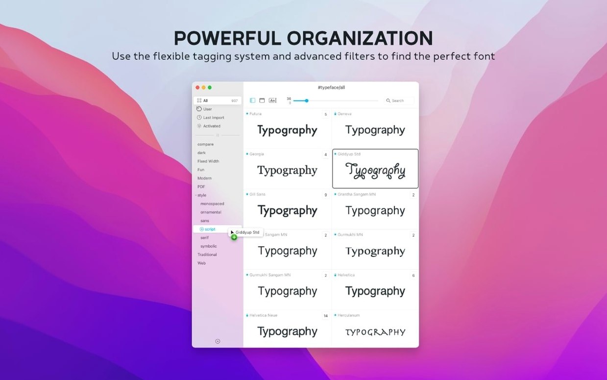
- Grouping fonts with tags instead of fixed folders, so one font can live in “serif,” “book cover,” and “client drafts” at the same time.
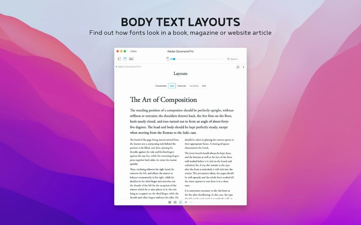
- Comparing families side by side with adjustable text samples and sizes, which helps catch weight and spacing differences early.
- Sorting by the new Last Activated column to see what you actually reached for in the past month.
Keep in mind
- Requires macOS 12 or later — older Macs won’t run it.
- The interface supports English, German, Dutch, French, Czech, and Japanese, so it works across a few language setups but isn’t fully localized for every region.
- Runs on both Apple Silicon and Intel Macs, downloaded as a disk image that you drag into Applications.
Let it run in the background before you tag anything
Don't try to organize everything on day one. That path leads to tagging fatigue and you'll dread opening the app. Instead, install it and let it sit quietly in the background for a week while you work normally. Every time you pick a font for something real — a poster, a slide deck, a product label — open Typeface and add a one-line note. "Felt too thin at 14pt on matte paper" or "Client liked this for the subheads." That's it. After a few days you'll have a small, honest set of notes attached to fonts you actually use, not fonts you think you might use someday.
Second tip: set a custom sample text early. The default pangram is fine for spotting letterforms, but a sentence from your own work reveals things a fox-jumps-over-the-lazy-dog never will. A shop owner might paste in product names with accented characters. A zine designer could use a fragment of the next issue's pull quote. The difference between "looks nice" and "works for this job" often hides in a single word.
Side-by-side comparison tabs for client work
Graphic designers with sprawling font libraries are the obvious fit — especially anyone who juggles client work across different styles and needs to revisit choices weeks later. The side-by-side comparison alone saves the kind of minute-by-minute friction that adds up to a tired afternoon.
But Typeface also makes sense for people who don't think of themselves as typographers at all. A newsletter editor who inherited a mess of Google Fonts and system defaults. A shop owner designing her own packaging and realizing she has forty-seven fonts installed, none of which she can name. A student laying out a thesis who needs to match a department's typeface requirements without buying anything new. The app doesn't demand font expertise — it rewards curiosity about what's already sitting on your drive.
If your work involves hunting down a specific look from a typeface torrent you grabbed months ago, the notes field and last-activated sorting turn a chaotic folder into something you can actually navigate. You stop guessing which version of that condensed sans was the one you used for the summer collection.
Smooth live previews, even scrolling hundreds of fonts
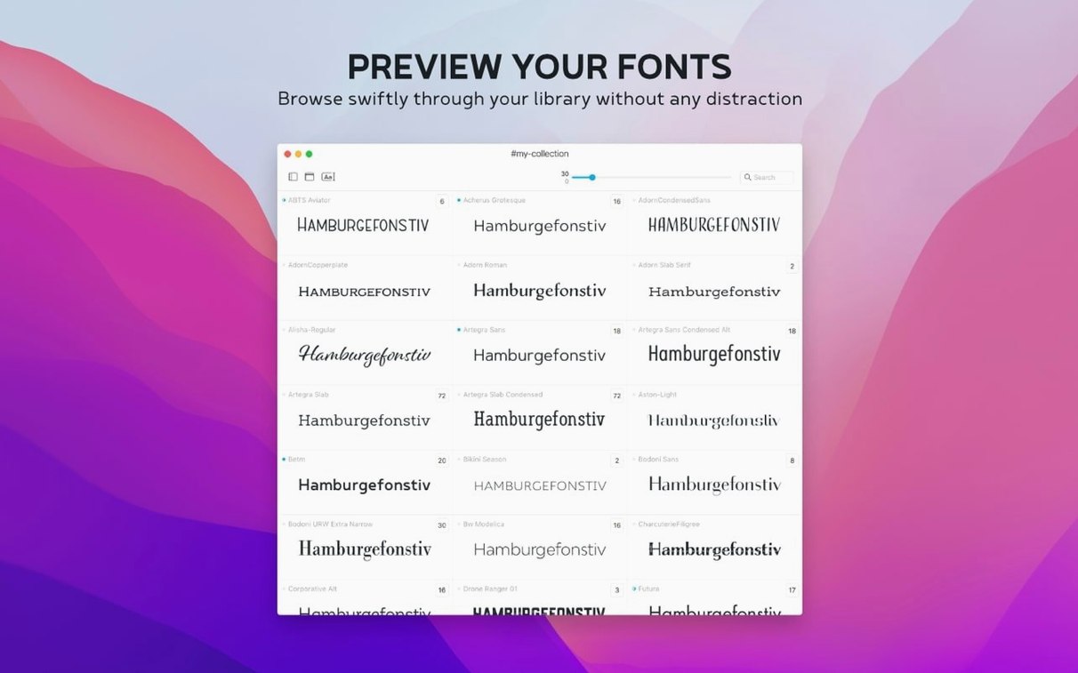
Speed is unremarkable — which is a compliment for a font tool. Scrolling through hundreds of installed fonts with live previews stays smooth on Apple Silicon Macs, and I haven't seen the beachball on an Intel machine either, though your mileage depends on how many custom fonts you've loaded. The app opens in under two seconds cold, faster when it's already in memory.
Memory use hovers in the low hundreds of megabytes even with a few thousand fonts indexed. It won't compete with a browser full of tabs or a rendering job, and it doesn't seem to leak over long sessions. I've left it open through a full workday without noticing any gradual slowdown.
Stability is the quiet kind. No crashes during tagging sprees or when importing Google Fonts in batches of a few hundred. The .otc support in 4.5 handles collection files without stuttering — they preview as cleanly as single .otf or .ttf files. The Notes field saves instantly; there's no save button to remember and nothing gets lost if you switch to another font mid-thought.
The interface stays out of the way. After the first hour you stop noticing it and just reach for it when you need to check a glyph or remember why you kept that peculiar display face installed. That's the right posture for a utility app — present when called, invisible otherwise.
Tip: When you install a batch of .otc files, the new format support means they show up without extra conversion steps.
A few quiet additions in 4.5 that make day-to-day font wrangling smoother:
- A Notes field in the Info tab — jot down why a font made the shortlist, and search those notes later from the overview.
- A Last Activated column, with sorting, so you can spot which fonts you actually used recently.
- Support for .otc font files, so OpenType collections appear without extra fuss.
- macOS 12 or later
- Works on Apple Silicon and Intel Macs
Questions from the stall
What does the Notes field in Typeface 4.5 do?
It adds a free-text area in the Info tab so you can record why you chose a font, and those notes become searchable from the overview.
Notes from other shops 0
Sign in or open a shop account to leave a note.
No notes yet. If you've used this on a shop Mac, tell me how it went.