It runs on any Mac with macOS 12.3 or later, both Intel and Apple Silicon machines. Here’s what else you need to know.
The real deal, term by term
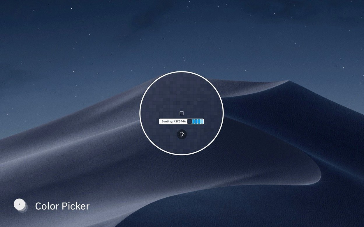
Color picker — A system-wide eyedropper that grabs colors from anywhere on your screen. You can sample multiple colors at once by holding Shift or Ctrl, which is a huge time-saver when you’re pulling a palette from a single image.
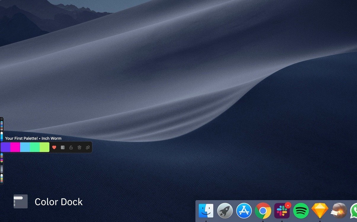
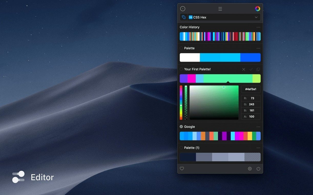
Palette organization — Every color you pick lands in a collection you can name, reorder, and group. Think of it like a tidy shelf for your swatches, not a loose pile.
Custom color formats — You’re not stuck with hex. Output colors in the format your design tool or code expects, and switch between them on the fly.
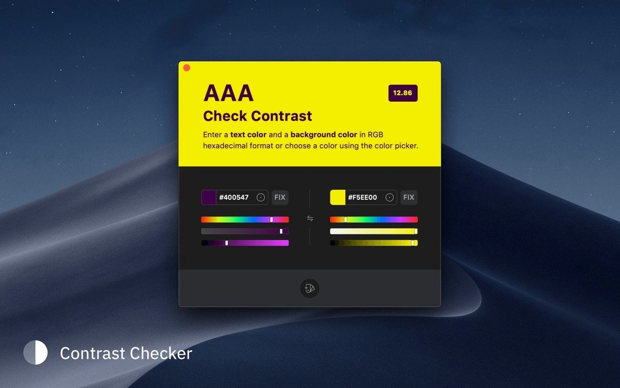
Contrast checking — It calculates contrast ratios against accessibility standards and can auto-correct a pair to meet them. Useful when you’re designing for readability, not just for looks.
Docked panel — You can pin a compact color panel to the edge of your screen. It stays put while you work in other apps, so your current palette is always a glance away.
Smarter contrast fixes and smoother palette sharing
Version 5.1 tidied up a handful of friction points that people bump into during a normal workday. The contrast checker got smarter about suggesting fixes when you're nudging text over a busy background—less manual tweaking, more one-click corrections. Palette sharing became less fussy too. You can now send a set of swatches by email straight from the app without exporting a file first, which keeps things moving when you're trading colors with a client or a collaborator.
Another quiet improvement: the docked panel remembers its position more reliably across restarts and display changes. If you use a MacBook that regularly hooks up to an external monitor, that alone saves a few seconds of rearranging every morning. Multiple color selection with Shift and Ctrl also got refined so it feels more predictable when you're grabbing scattered sample points from a large canvas. No new flashy tools—just the existing ones working a little harder on your behalf.
Designers bouncing between Sketch and Figma all day
It's built for anyone who reaches for a color at least a dozen times a day, but a few kinds of Mac users will squeeze more out of it than others.
UI and web designers who bounce between Sketch, Figma, and browser dev tools. The custom format support means you copy a color once and paste it in whatever syntax your current tool expects, without a detour through a converter. The contrast checker earns its keep when you're designing type-heavy interfaces or building a design system that has to pass accessibility reviews.
Front-end developers who write CSS by hand and prefer to grab colors from a mockup rather than guess hex codes. Sip sits quietly in the menu bar, and a quick eyedropper drag beats opening a separate inspector any day. Since it's a native Mac app—not a web tool—it stays responsive even with a dozen palettes open.
Small-shop owners making their own branding, product photos, or social media graphics. If you taught yourself enough design to get by, having a palette shelf that doesn't vanish between sessions means your brand colors are always one click away. Pair it with a sip macos free workflow substitute and you've got a lightweight color toolkit without piling on subscription software.
Illustrators and digital painters who build palettes from reference images. Shift-clicking to sample a whole mood board at once and saving it as a named snapshot cuts out a repetitive step that used to eat up the first ten minutes of a session.
If you only pick a color twice a week, the built-in macOS Digital Color Meter probably covers you. But once color becomes part of your daily rhythm, a dedicated picker with a memory starts to feel less like a luxury and more like a missing piece of the toolbox.
- macOS 12.3 or newer
- Works on Intel and Apple Silicon Macs
Notes from other shops 0
Sign in or open a shop account to leave a note.
No notes yet. If you've used this on a shop Mac, tell me how it went.