

You’ve just opened a fresh document and are staring at a blank spread, maybe with a rough batch of photos and a Word doc from a client waiting in a folder. Affinity Publisher gives you a straightforward set of tools to turn those pieces into a laid-out booklet, flyer, or brochure without fighting the interface.
System requirements and current release info
| What | Details |
|---|---|
| Current version | 2.6.5 |
| Developer | Serif Labs |
| Runs on | macOS 10.15 or later, Intel & Apple M-series |
Build a cascading set of reusable master pages
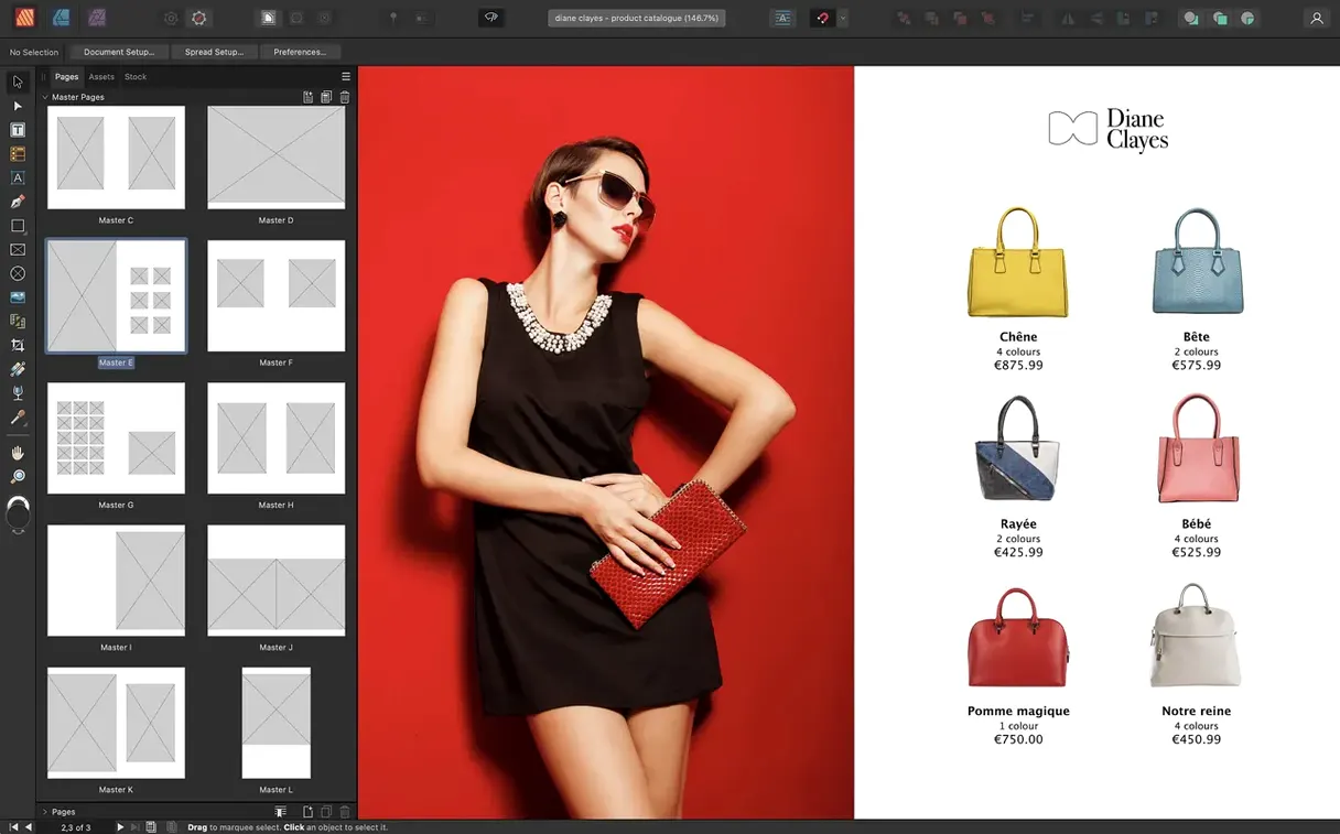
Start with a dynamic master page. Open the Pages panel, double-click a master, and place a text frame or logo in a spot that repeats across chapters. When you nest a second master inside the first, you can build a consistent structure that still lets individual sections vary their layout — useful for catalogues or manuals.
Next, place an image and pull up the Text Wrap panel. Set it to Tight and watch body copy flow around the subject. OpenType features sit in the Character panel, ready when you want true small caps or tabular figures in a data-heavy page.
Version 2.6.5 added multiple-page spreads, so try a gatefold or trifold. In Document Setup, switch the spread model to a folding layout and add pages until your mockup matches the final piece. The Reading Order panel is worth a click before exporting a PDF — drag items into the right sequence so a screen reader announces content sensibly.
Assembling an 8-page product catalogue from scratch
Let’s say you’re putting together a small product catalogue — eight pages, saddle-stitched, with photos from a light tent and copy the client sent as a messy Word file. Here’s how the first hour tends to go.
You open Affinity Publisher and hit New Document. In the dialog, pick Print, set the page size to A5, check Facing pages, and give it eight pages. Before clicking OK, you glance at the Margins tab and set all sides to 10 mm — plenty for a stapled booklet. The bleed goes to 3 mm because the printer asked for it.
A blank spread fills the workspace. You open the Pages panel and double-click Master A. On this master you drop a page number marker in the bottom outer corner and a thin rule just above it. Nothing else. Then you create Master B, right-click it, and choose Apply Master to Pages — you send it to pages 2–7. On Master B you place a small logo top-left and a tinted bar across the top. That’s the section framework done in under five minutes.
Now you switch to page 1 and drag your cover image straight from Finder onto the spread. Affinity Publisher places it as an embedded image — you can see it in the Resource Manager. You resize with the Move tool, holding Shift, until the focal point sits where you want it. A headline goes into a text frame, set in a heavy weight, and you nudge the tracking until it breathes.
For the inside pages, you place the Word file using File → Place. The cursor loads with text; you draw a frame on page 2 and the text flows in. When the frame overflows, you click the red linking triangle near the bottom-right handle and draw the next frame on page 3. Affinity Publisher links them. Now the story threads across spreads, and any edits upstream ripple through the whole chain.
Photos come next. You place a TIFF of a ceramic mug, set the Text Wrap to Square with a 2 mm offset, and watch body copy reflow around it. A quick Levels adjustment layer — right on the image, non-destructive — lifts the shadows slightly. You repeat this for each product shot, pulling the same adjustment onto new images by Option-dragging the layer in the Layers panel.
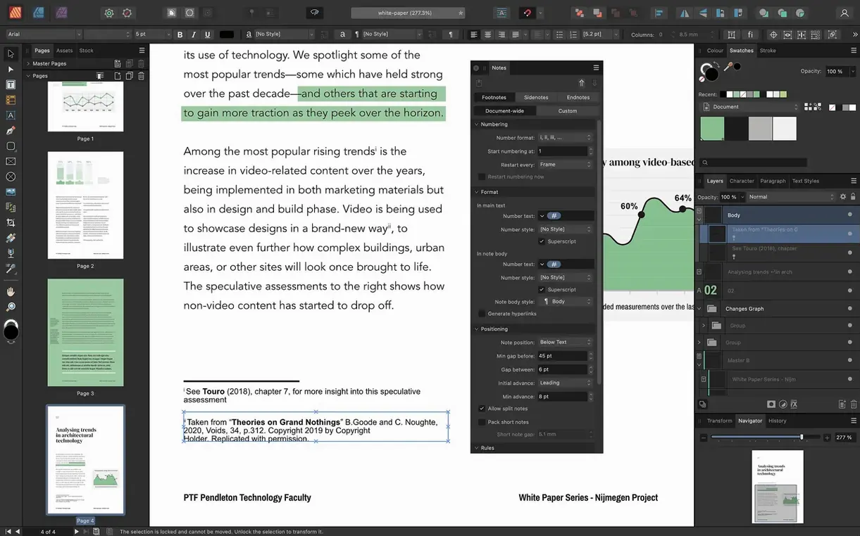
Before exporting, you open the Reading Order panel. You drag the headline to the top, the body text next, then each image’s alt-text entry. It takes thirty seconds and means the PDF won’t be a mess for a screen reader. Finally, File → Export → PDF/X-4, check Include bleed, and send it off to the printer.
Keep your selected text frame after deleting its content
Out of the box, Affinity Publisher works well, but a few preferences make the daily grind noticeably smoother.
- General → Prefer to keep selection when clearing a text frame. Turn this on. Without it, hitting Delete while editing text removes the frame itself — a surprise that can cost you a layout element if you’re moving fast.
- Tools → Move Tool Aspect Ratio Constrain. Set to Automatic based on image properties. This way, placed photos keep their native proportions unless you deliberately override, saving you from accidentally stretched product shots.
- User Interface → UI Gamma. Slide it a little darker if you work in a dim room. The default light-gray canvas can wash out subtle contrasts on bright displays.
- Performance → RAM Usage Limit. The installer says 8 GB is recommended, but if you’re on a 16 GB machine, raising this to around 10 GB helps when you embed fifty high-res photos and still want smooth scrolling.
- Colour. If you’re designing for print, switch the default RGB profile to a CMYK one under Colour Profiles so new documents start in the right space. You can still override per document, but a sensible default cuts mistakes.
In the Snapping Manager (View → Snapping Manager), bump Screen Tolerance down to 4 or 5. The default sometimes snaps too eagerly; a tighter setting makes aligning objects around busy spreads feel less sticky.
Drag images straight from Finder onto the page
A few things hide in plain sight — you might not stumble on them until months in, but they quietly speed up layout work.
- Place by dragging from Finder. You don’t need File → Place. Grab any JPG, PNG, or Affinity file from a Finder window and drop it on the canvas. Hold Shift before releasing to place it at full size instead of a thumbnail.
- Quick grid with the Frame Text tool. Click and drag a text frame, then — before letting go — tap the Right Arrow key to split it into columns. Tap Up Arrow to add rows. You can build a simple grid of linked frames in a second.
- Select behind. Hold Command and click repeatedly on overlapping objects. Each click cycles down through the layer stack. No need to open the Layers panel when a text frame sits under a transparent PNG.
- PhotoShop file layers. Placed PSDs keep their layers if you leave Linked checked during Place. Double-click the placed image later, and Affinity Publisher opens a temporary editing view of just that file — spread still visible behind it.
- Text frame scaling. Grab the bottom-right handle of a frame, start dragging, then hold Command. The text inside scales visually with the frame. Great for fitting headlines without opening the Font Size field.
- Baseline grid toggle. View → Show Baseline Grid gets its own shortcut worth memorizing — especially when a spread’s body copy goes slightly off-rhythm and you need to see why.
A workflow: event flyer from start to finish
Imagine a craft fair flyer — A5, double-sided, with a vendor list, a map, and some decorative flair. Here’s a realistic path through it.
1. Document and master setup. New document, A5, facing pages off (it’s a single folded sheet), 3 mm bleed. On Master A, you draw a thin rectangle running the full height of the left edge — a colour band the client wants. You also place a small handmade-goods logo top-right. This master gets applied to both pages.
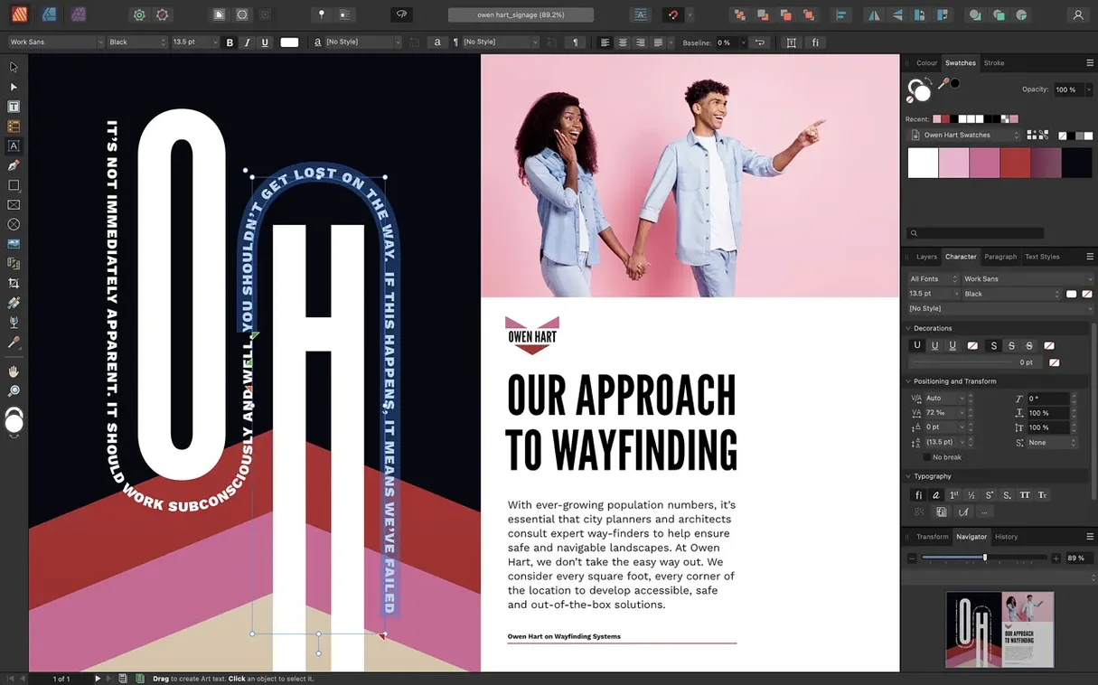
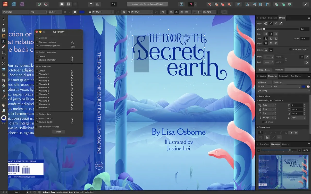
2. Front page — the eye-catcher. You place a large background photo, then drop a vector shape over it from the Assets panel. With the shape still selected, you head to the Transparency panel and set its blend mode to Multiply, knocking the photo back so white headline text pops. The headline uses an OpenType font with swash alternates — you pick a nice one from the Typography section of the Character panel. Event date goes in a smaller frame below, aligned to a column guide you dragged out from the ruler.
3. Back page — the information layer. You place the vendor list from a text file. Instead of one long frame, you split it into two columns by clicking the frame, opening the Text Frame panel, and setting Columns to 2 with a 5 mm gutter. A small vector map of the venue sits in the lower third. You drew it earlier in Affinity Designer, but StudioLink lets you switch to the Designer persona right here — so you tweak the path of a street without leaving Publisher. When you click back to the Publisher persona, the map is updated.
4. Fine-tuning and polish. The vendor names need consistency. You create a Character Style called “Vendor Name” — bold, slightly tracked out, a muted navy instead of pure black. You apply it by selecting each name and pressing the style shortcut you assigned in the Text Styles panel. A drop cap on the introductory paragraph adds a bit of print-shop character; you set it to two lines in the Paragraph panel
Affinity Publisher 2.6 brought a few long-requested layout tools that small shops will appreciate straight away:
- Multiple-page spreads — set up gatefolds, trifolds, and accordion folds directly in one spread instead of stitching pages together later.
- Reading Order panel — define the logical flow of text and images for accessible PDF export without leaving the layout view.
- macOS 10.15 or newer
- Intel or Apple M-series processor
- 8 GB RAM recommended
- Up to 2.8 GB of available drive space; more needed during installation
- Display resolution 1280×768 or higher
Notes from other shops 0
Sign in or open a shop account to leave a note.
No notes yet. If you've used this on a shop Mac, tell me how it went.